Friday, 7 May 2010
Existing Film Magazine Covers
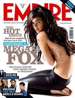
The title of the magazine is the biggest, boldest font and is also the only writing in red. This means that is catches the attention of the audience easily.
Next to the image of Megan Fox, her name and the film she is in are clearly presented to inrigue people into buying the magazine. It also explain what feature is in the magazine; an interview with the actress.
The names of other films are featured in the magazine are included on the cover of a similar genre to capture a specific audience. If people like these other films, they are likely to buy the magazine to find out about the newest one.
The price and date of the magazine along with the magazines website are presented at the top of the magazine which shows that the magazineis professional and reliable, encouraging more people to buy it.
The tag line under the title reads ' the worlds biggest movie magazine' which could also encourage people to buy the magazine as it makes 'Empire' magazine seem like the better film magazine compared to any others.
The magazine cover uses a minimum amount of colours, making it simple but still effective enough to interest people into buying it. The colours on this cover are very masculine and rough such as black and blue, which again suggests the genre of the featured film at a glance.
Existing Film Posters
This poster is for the film 'One Missed Call'. I noticed that the black background adds a sincere and gloomy atmosphere to the poster as well as making the image stand out. The poster doesnt give much away about the film; the identity of the character is disguised and the only information that gives the audience any idea about the film is the title of the film.
The poster also features a question, which adds a chilling effect. It makes the audience wonder what relevance the question has to the film and an element of mystery is created.
The poster also shows the date of release, making people eager to see it.
I also noticed that the only three colours used are red, black and white. This technique highlights the fact that the film is horror as red has connotations of danger and blood, and black creating a sinister, eerie feel, but also keeps the poster simple so that it stands out.
This film poster used similar techniques to the first one. A mysterious element is created by not revealing the identity of the character the the poster is focused on, leaving audiences wondering who they are and what they are going to do. This poster gives away slightly more information that the first once, including what other films the director has directed and who the film was made by. This can influence people to see the film if they have already seen the other film and liked it or particularly like to director.
Again, the only colours used are red, black and white to create the same effect as the 'One Missed Call' poster.
This poster is created in a slightly different way to the last two posters, but still manages to create the same atmosphere. Again, the identity of the character is disguised, creating a mysterious element.
However, this poster has a colder effect, as it seems grey and frosty. This gives connotations of the supernatural rather than brutality. The fact that the character is peering through the window suggests the storyline; it seems as if the character is an outsider trying to break in.
This poster includes the producers and what previous films they have created encouraging people to see the film. I noticed that whereas the other posters use plain, simple fonts, this one has used a more creative font to highlight the genre of the film. The font seems handwritten, giving the impression someone is there and has written it; i think that this adds a creepy feel to the film as the audience do not know who has written it or why.
Titles
We think this font is effective as it gives the impression that it has been scratched into something, representing the anger of the main character
We like this font as it seems careless and scruffy, again representing the personality of the character however it is quite hard to read at a glance
This font is effective in the way it seems handwritten as it seems personal from the character, however we are looking for a rougher font.
We think that this font may be too scruffy and over the top and this makes it loose its chilling aspect.
This font is effective as it is rough and also fairly simple making it easy to read aswell as well as giving off a scary feel.
We liked this font at first as it seems like the most realistic handwritting but we then realised that as the characters are quite close together it makes it difficult to read the word when you only see it for such a short amount of time.
We looked at this font at first as we wanted a handwritten style to reflect the characters personality, however this font seems too precise and drawn, not giving the right effect.
This font is good in the way that it is quite messy but it is not bold enough to make the name of our film stand out.
Changes to Storyboard
Script Alteration 2
Script Alteration
At the beginning of our trailer Katie May is seen saying:
"Have you ever loved someone so much you'd do anything to have them?"
The line of dialogue we have added is:
"...well I did.."
Having this line appearing at the end of our trailer concludes what Katie May is saying at the beginning and leave the viewers wanting to know the story behind it.
Editing Progress
Tuesday 10th November
- We put the different shots in the right order
Wednesday 11th November
- We cut up certain clips to create a jumpy 'flicker effect' as it makes the trailer seem disorientated and confusing
- We added a video camera border to certain clips that we meant to be filmed by one of the characters using a hand-held camera
Friday 13th November
- We added the titles 'Katie May' and 'Coming Soon' into the trailer