Friday, 7 May 2010
Existing Film Magazine Covers
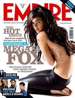
The title of the magazine is the biggest, boldest font and is also the only writing in red. This means that is catches the attention of the audience easily.
Next to the image of Megan Fox, her name and the film she is in are clearly presented to inrigue people into buying the magazine. It also explain what feature is in the magazine; an interview with the actress.
The names of other films are featured in the magazine are included on the cover of a similar genre to capture a specific audience. If people like these other films, they are likely to buy the magazine to find out about the newest one.
The price and date of the magazine along with the magazines website are presented at the top of the magazine which shows that the magazineis professional and reliable, encouraging more people to buy it.
The tag line under the title reads ' the worlds biggest movie magazine' which could also encourage people to buy the magazine as it makes 'Empire' magazine seem like the better film magazine compared to any others.
The magazine cover uses a minimum amount of colours, making it simple but still effective enough to interest people into buying it. The colours on this cover are very masculine and rough such as black and blue, which again suggests the genre of the featured film at a glance.
Existing Film Posters
This poster is for the film 'One Missed Call'. I noticed that the black background adds a sincere and gloomy atmosphere to the poster as well as making the image stand out. The poster doesnt give much away about the film; the identity of the character is disguised and the only information that gives the audience any idea about the film is the title of the film.
The poster also features a question, which adds a chilling effect. It makes the audience wonder what relevance the question has to the film and an element of mystery is created.
The poster also shows the date of release, making people eager to see it.
I also noticed that the only three colours used are red, black and white. This technique highlights the fact that the film is horror as red has connotations of danger and blood, and black creating a sinister, eerie feel, but also keeps the poster simple so that it stands out.
This film poster used similar techniques to the first one. A mysterious element is created by not revealing the identity of the character the the poster is focused on, leaving audiences wondering who they are and what they are going to do. This poster gives away slightly more information that the first once, including what other films the director has directed and who the film was made by. This can influence people to see the film if they have already seen the other film and liked it or particularly like to director.
Again, the only colours used are red, black and white to create the same effect as the 'One Missed Call' poster.
This poster is created in a slightly different way to the last two posters, but still manages to create the same atmosphere. Again, the identity of the character is disguised, creating a mysterious element.
However, this poster has a colder effect, as it seems grey and frosty. This gives connotations of the supernatural rather than brutality. The fact that the character is peering through the window suggests the storyline; it seems as if the character is an outsider trying to break in.
This poster includes the producers and what previous films they have created encouraging people to see the film. I noticed that whereas the other posters use plain, simple fonts, this one has used a more creative font to highlight the genre of the film. The font seems handwritten, giving the impression someone is there and has written it; i think that this adds a creepy feel to the film as the audience do not know who has written it or why.
Titles
We think this font is effective as it gives the impression that it has been scratched into something, representing the anger of the main character
We like this font as it seems careless and scruffy, again representing the personality of the character however it is quite hard to read at a glance
This font is effective in the way it seems handwritten as it seems personal from the character, however we are looking for a rougher font.
We think that this font may be too scruffy and over the top and this makes it loose its chilling aspect.
This font is effective as it is rough and also fairly simple making it easy to read aswell as well as giving off a scary feel.
We liked this font at first as it seems like the most realistic handwritting but we then realised that as the characters are quite close together it makes it difficult to read the word when you only see it for such a short amount of time.
We looked at this font at first as we wanted a handwritten style to reflect the characters personality, however this font seems too precise and drawn, not giving the right effect.
This font is good in the way that it is quite messy but it is not bold enough to make the name of our film stand out.
Changes to Storyboard
Script Alteration 2
Script Alteration
At the beginning of our trailer Katie May is seen saying:
"Have you ever loved someone so much you'd do anything to have them?"
The line of dialogue we have added is:
"...well I did.."
Having this line appearing at the end of our trailer concludes what Katie May is saying at the beginning and leave the viewers wanting to know the story behind it.
Editing Progress
Tuesday 10th November
- We put the different shots in the right order
Wednesday 11th November
- We cut up certain clips to create a jumpy 'flicker effect' as it makes the trailer seem disorientated and confusing
- We added a video camera border to certain clips that we meant to be filmed by one of the characters using a hand-held camera
Friday 13th November
- We added the titles 'Katie May' and 'Coming Soon' into the trailer
Time Schedule
Examples of Missing Posters
These are existing missing posters that we looked at to make our prop as realistic as possible. We noticed that all the posters have a big image of the missing person and the word 'missing' is the largest on the poster to catch peoples attention. In all of the posters, this word is presented in red to make it stand out even more. The posters also include physical details about the person that is missing.
Camera Techniques
The Script
We are aiming to leave the audience guessing and wondering about the film, as much as possible. By doing this we are aiming to create as much suspense as we can in the trailer to attract the right type of target audience .
The one line of our script is " Have you ever loved someone so much, you would do anything to have them..?". This line is said by the main character and can be heard over the first and second shot. This line is the key plot to the main film, so is used in the Teaser Trailer to create the same atmosphere in both the trailer and the film.
Props, Setting, Location and Characters
Props
Missing poster
Photos of couple
Flour/sherbet £10 note
Bottle of vodka
Cigarette
Chair
Necklace
Knife
Rope
Fake blood e.g. ketchup
Torch
Characters
Katie
Callum
Sophie
Costume
Katie – dark/black clothes
Callum – casual e.g. jeans and a t-shirt
Sophie – pretty girly clothes
Locations
Dark room
Outside. On college grounds.
Outside – tree
Inside college e.g. corridor
Shot 1
Props – Spotlight (Torch)
Character – Katie (looking rough)
Location – Dark room
Shot 2
Props – n/a
Character – Callum
Location – Outside on college grounds
Shot 3
Props – n/a
Character – Callum and Sophie
Location – Outisde on college grounds
Shot 4
Props – n/a
Character – Callum and Sophie
Location – Outside on college grounds
Shot 5
Props – Missing poster
Character – n/a
Location – Outisde - tree
Shot 6
Props – n/a
Character – Katie
Location – Dark room
Shot 7
Props – n/a
Character – Katie, Sophie, Callum
Location – Outside college grounds
Shot 8
Props – Photos
Character – n/a
Location – Dark room
Shot 9
Props – Flour/sherbet and £10 note
Character – Katie
Location – Outside
Shot 10
Props – Vodka bottle
Character – Katie
Location – Outside
Shot 11
Props – Cigarette
Character – Katie
Location – Outside – smoking area
Shot 12
Props – n/a
Character – Katie
Location – Outside college grounds
Shot 13
Props – Chair
Character – Sophie
Location – Dark room
Shot 14
Props – n/a
Character – Callum
Location – Outside
Shot 15
Props – necklace
Character – Callum and Sophie
Location – Outside
Shot 16
Props – Necklace
Character – Katie
Location – Dark room
Shot 17
Props – Necklace
Character – Katie
Location – Dark room
Shot 18
Props – n/a
Character – Sophie
Location – Dark room
Shot 19
Props – Knife
Character – Sophie Katie
Location – Dark room
Shot 20
Props – Vodka bottle
Character – Katie
Location – Outside
Shot 21
Props – n/a
Character – Callum
Location – Outside – high ground
Shot 22
Props – n/a
Character – Katie
Location – Dark room
Shot 23
Props – Rope
Character – Katie
Location – Dark room
Shot 24
Props – n/a
Character – Sophie
Location – Corridor
Shot 25
Props – n/a
Character – Callum
Location – Corridor
Shot 26
Props – n/a
Character – Katie
Location – Dark room
Shot 27 – TITLE
Shot 28
Props – Neckalce
Character – Katie
Location – Dark room
Synopsis
The two other main characters of our story are Callum and Sophie, a couple of the same age as Katie. We see a relationship between Sophie and Katie building through the story although it is not a good one.
The main character of our film is a teenage girl named Katie. She is around 17 years old and at college. At first she seems like a typical teenage girl but the plot of the film begins to tell the audience otherwise.
The film is set in a college/school environment to portray typical teenage life.
The whole story is a memory of Katie whilst she is being interviewed by the police as a suspect of a horrible crime. The beginning of the story shows her with a jealous attitude towards two other characters Sophie and Callum, a couple. Katie has feelings for the boy, which leads her to scary behaviour.
Katie, a depressed teenager with an obsession for Callum rebels and takes drugs, smokes and drinks. This lifestyle affects her mental state and she acts in an odd way. She is seen to know all about Callum’s life, even though they have never met.
Sophie mysteriously goes missing with no suspects. However, Katie is the kidnapper. She takes her and keeps her hostage, torturing her as a result of her jealousy.
We see a serious of events between the two girls, whilst no one knows where Sophie is or who has taken her.
Throughout the story Katie leads herself to believe that she is the girlfriend of Callum and imitates Sophie. Her behaviour gets gradually weirder as her obsession grows.
The story is slowly revealed at the end. Katie tells police that she is the victim and that Sophie threatened her and stole her boyfriend, her motivation for committing the crime. However, when we see an interview between Callum and the police, he says he has never heard of or met Katie in his life. The audience then see how obsessed and unstable she is.
Film Marketing Campaign
The genre of film we have chosen to create is horror/thriller. I have chosen a film of the same genre and researched the marketing campaign used to advertise the film. I have looked at effective trailers and posters as an example of how my own film would have been advertised.
Word of mouth
Teaser trailers and posters of the film would have started people questioning about the plot. They would encourage people to talk and ask about the film, therefore intriguing a wide range of people about the story and release date.
The Happening released no preview screenings, which could have massively helped word of mouth as people who had seen it before the release date would have told others about it, sparking their interest in also seeing the film.
TV/Press
Interview - http://www.imdb.com/video/screenplay/vi1122631961/
News report - http://www.imdb.com/video/cbs/vi4002873369/
Behind the scenes - http://www.youtube.com/watch?v=Ldwj28lKFVE&feature=PlayList&p=E353C27D4DEC8C2A&playnext=1&playnext_from=PL&index=12
All of these TV features give audiences more information about the film plot and characters. The interview will show audiences the actors giving their view on the film, interesting them to go and see them perform in it. The news report and behind the scenes feature give a brief idea of what the film is about, intriguing people to go and watch the completed film.
Online and mobile
Official website - http://www.thehappeningmovie.com/
The website to the film includes information such as cast members, a gallery and downloads, all promoting the film and making audiences want to find out more.
Posters
All three posters are eye-catching and a good way to remind people that this film will soon be released. They all contain the director and title, giving people an idea to which genre of film it is and what it may be about. 'The Happening' suggests a mysterious event, leading people to be interested in finding out what the film is about. The posters have a scary feel to them, chilling audiences and sparking questions about what has happened. Each poster has connotations of abandonment for example, the empty cars on the road, giving a vague clue to what might have occurred. Having three posters instead of one gives audiences a wider idea of what the film may be about as each presents a different situation.
The happening had no merchandise other than posters. Other merchandise could have helped the film become bigger as it would have advertised the film and fans would have bought it to support it.
Trailers
Official trailer - http://www.imdb.com/video/imdb/vi3001418009/
Teaser trailer - http://www.youtube.com/watch?v=5oceYKBAHtg
The teaser trailer opens with short scenes of the film. They have no dialogue, leaving audiences confused and wondering what has happened. Further on in the trailer, the clips get shorter and faster and dialogue is introduced, giving more of an idea what the film is about, but still containing a mysterious element. At the end of the trailer, the film title is shown along with 'coming soon'. No release date is mentioned, keeping the audience waiting and wondering.
The official trailer starts of quite slowly, building up the tension. This technique also makes audiences feel nervous as they are not sure what will happen next, keeping them curious. It then gets faster, vaguely revealing the story of the film. Short clips of the film are shown rapidly, creating a sense of confusion and mystery to the film. This trailer would have been shown nearer the release date of the film, to let audiences know something about the story and tell them the release was soon.
Premier
The premier for the film would have caused excitement for the release date. Press from the premier would have advertised the film even more and hopefully have encouraged more people to go and see it when it was finally released. Celebrities would have also given the film a good image and encouraged people to go and see it.